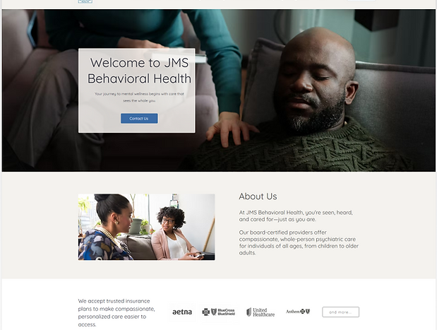
JMS Behavioral Health
JMS Behavioral Health is a telehealth psychiatric practice offering compassionate, whole-person care to clients across New Jersey, Delaware, and Pennsylvania. Their team of board-certified psychiatric nurse practitioners supports individuals of all ages through personalized treatment that honors the mind, body, and spirit.
Web Design
Responsive Design
B2C
Live Product
My Contribution
UX Research
Wireframing
Prototyping
Mockups
User Interface Design

Project Overview
Full website design, branding and design system creation.
Client
JMS Beavioral Health
My Role
Lead UX/UI Designer
JMS Behavioral Health is a telehealth psychiatric practice serving New Jersey, Delaware, and Pennsylvania. The client approached me to design a website that would promote their therapy business, clearly communicate their services, and reflect the homey, calming, and human-first tone of their brand.
They needed a site that inspired trust, made intake easy, and offered a clear view into who they are, what they treat, and how they help.
The Problem
JMS Behavioral Health wanted a website that truly reflected the warmth and care they offer in every session. What they had before felt distant and unclear; it didn’t show who they are or make it easy for people to understand their services, feel at ease, or know how to get started.
The Solution
Emotional calming visual design to create a welcoming atmosphere for people seeking help.
Human centered messaging. Using tone and language to emphasize paterneship, healing, and support.
Clear service and intake structure. Content blocks that break down services, conditions, insurance
Accessible and responsive layout. Making all content mobile friendly, and designed for clients of all ages.
The Goal
The goal was to design a website that clearly communicated who JMS Behavioral Health is and what they offer, while creating a space that feels calm, safe, and welcoming. The site needed to reflect their whole-person approach to care, make it easy for new clients to explore services, and guide them gently toward starting the intake process. Just as importantly, it had to feel trustworthy, accessible, and aligned with the compassionate way they show up for their clients every day.
My Process
1
Content Audit and Structure
Define the problem, establish goals, and organize the site into logical accessible sections:
-
Hero and welcome
-
Pain points
-
Features
-
Services
-
Information architecture
-
Content sections
2
Wireframes and Layout
-
Designed a mobile first, spacing-conscious layout
-
Modular cards for conditions and services
-
Strategic use of CTAs such as "Start with Support"
-
Ample spacing for emotional breathing room
3
Accessibility Considerations
-
High contrast and WCAG compliance
-
Readable Typography with clear section headings and readable fonts
-
Logical structure and semantic hierarchy
-
Mobile friendly layout
4
Visual Design
-
Create brand colors
-
Use nature inspired images to symbolize healing, growth, and forward movement
-
Maintain brand consistency through repeated color accents and uniform typography
-
Design layout rhythm to create visual breathing room
5
Testing and Feedback
-
Conducted a full walkthrough with stakeholders to gather initial impressions and identifying areas that need refinement
-
Confirming mobile responsiveness and tested layout on multiple devices and screen sizes
-
Ensured all key actions were intuitive and accessible
6
Launch and Post Support
-
Ensure the site launches smoothly and supports intake and client education
-
Stakeholders reported fewer repetitive questions about services, and positive feedback from old and new clients.
-
Check out the site
JMS Behavioral Health
Results and Key Takeaways
The new website launched right on schedule and quickly made a difference. Clients found it easier to understand what JMS offers, and the team noticed fewer repeated questions and more people starting the intake process. Visitors described the site as calm, welcoming, and easy to use, which was exactly the feeling we were aiming for. This project was a clear reminder that thoughtful language, clear structure, and a warm tone are not just design choices. They help people feel safe, supported, and ready to take the next step.